Graphic Design / Re-brand / Brand Strategy / Brand Identity
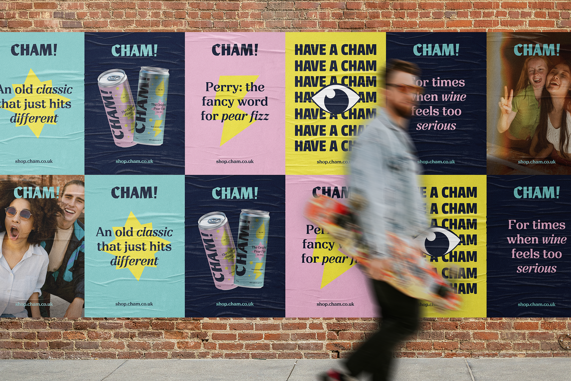
Babycham is an alcoholic Perry which dates back to the 1960's. I felt a drastic re-brand (including a new name) was needed to appeal to a new generation of drinkers.
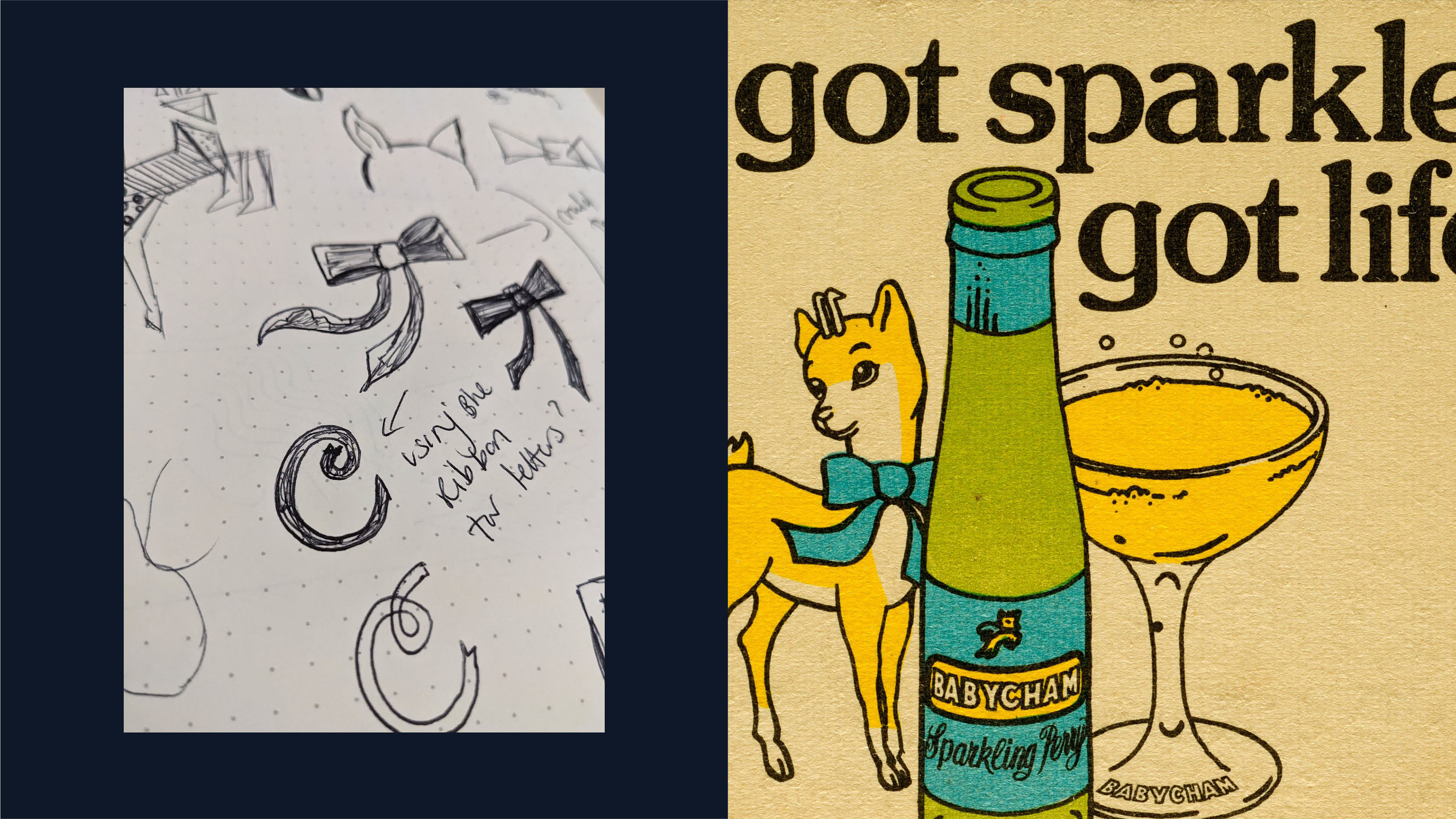
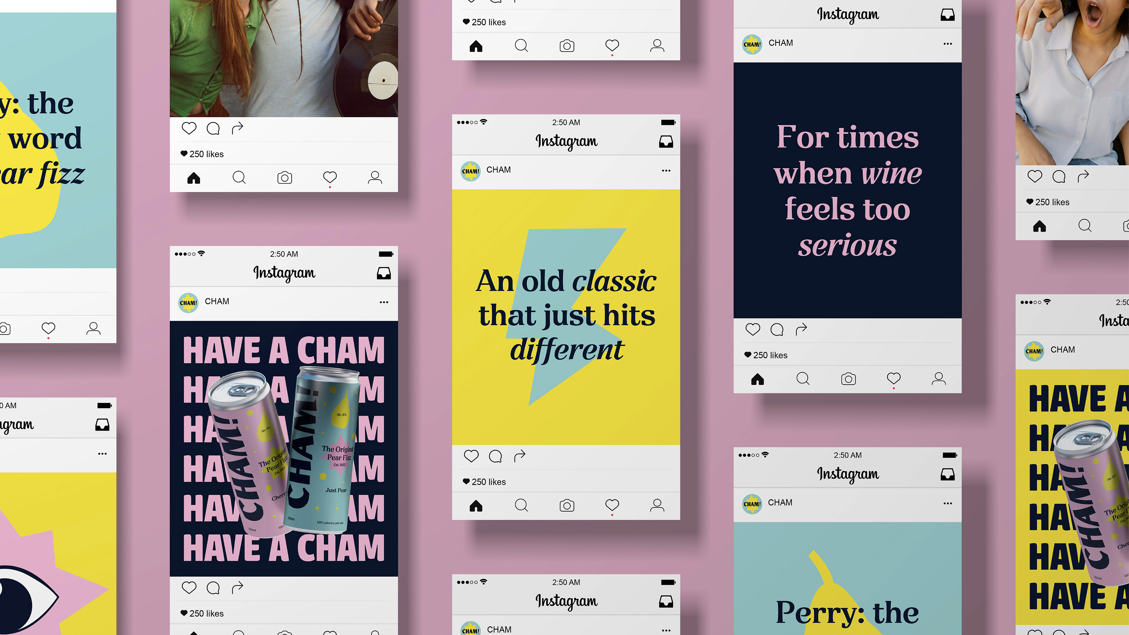
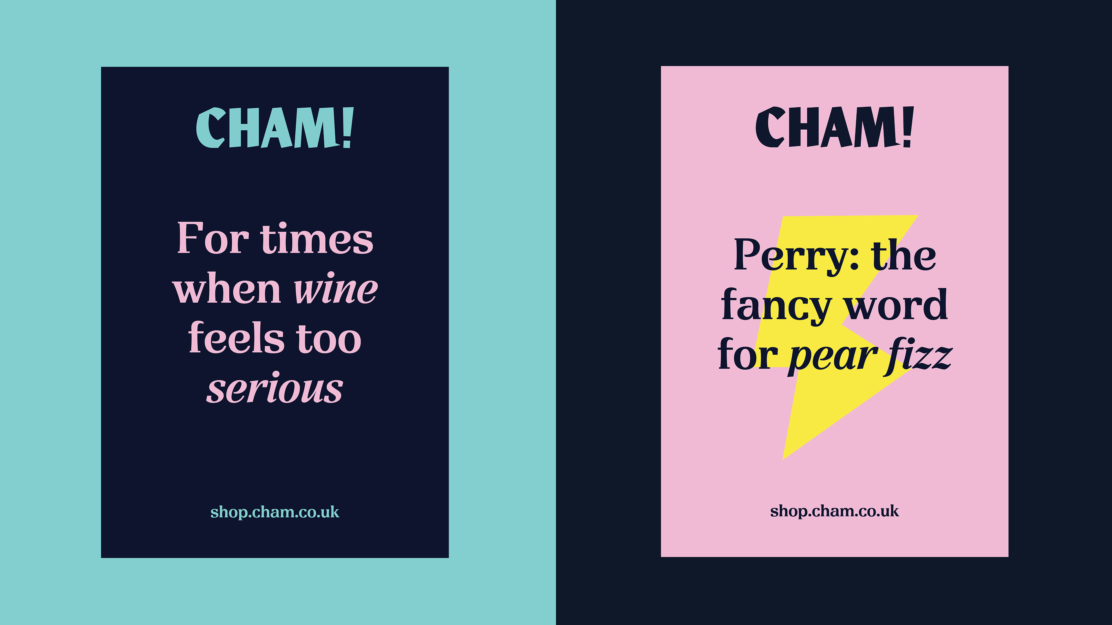
The new branding was inspired by the concept ‘A Retro Remix’, blending Babycham archive shapes with new additions. From research, Babycham has been compared to the taste of sparkling wine rather than cider so I chose to position it in this part of the alcohol market, but with a more laid-back and inclusive approach. With this in mind, I changed the packaging - the small wine-like bottle has been replaced with a 250ml can.


This work is a conceptual project. An open brief to rebrand a company of my choice, I devised the project from the initial brand strategy through to design.